Icon - Arrow LeftAn icon we use to indicate a rightwards action. Icon - Arrow RightAn icon we use to indicate a leftwards action. Icon - External LinkAn icon we use to indicate a button link is external. Icon - MessageThe icon we use to represent an email action. Icon - Down ChevronUsed to indicate a dropdown. Icon - CloseUsed to indicate a close action. Icon - Dropdown ArrowUsed to indicate a dropdown. Icon - Location PinUsed to showcase a location on a map. Icon - Zoom OutUsed to indicate a zoom out action on a map. Icon - Zoom InUsed to indicate a zoom in action on a map. Icon - SearchUsed to indicate a search action. Icon - EmailUsed to indicate an emai action. Icon - FacebookFacebooks brand mark for use in social sharing icons. flipboard Icon - InstagramInstagrams brand mark for use in social sharing icons. Icon - PinterestPinterests brand mark for use in social sharing icons. Icon - TwitterTwitters brand mark for use in social sharing icons. Icon - Check MarkA check mark for checkbox buttons.
You are reading

10 Easy Pieces: Architects’ Favorite Butter Yellow Paint Picks

Search

10 Easy Pieces: Architects’ Favorite Butter Yellow Paint Picks

June 4, 2025

Butter yellow is a very particular shade—not too saturated but also not so washed out that it becomes pastel. It’s commanding yet understated, and balances a bevy of complementary colors. We’ve consulted a selection of architects and designers for their favorite shades of butter yellow. Here are their picks.

san francisco interior designer lauren geremia of geremia design applied farrow 17
Above: San Francisco interior designer Lauren Geremia of Geremia Design applied Farrow & Ball’s Pale House No. 71 to the walls and ceiling of a Tudor-style house in northern California. “A luminous butter yellow,” she explains, “softens the striking angles of the double-height space.” Photograph by Laure Joliet for Geremia Design.
also featured in our post, \10 easy pieces: architects’ yellow paint pic 18
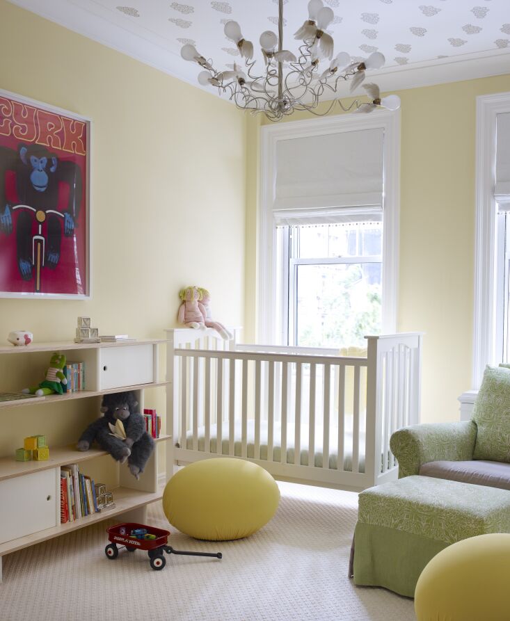
Above: Also featured in our post, 10 Easy Pieces: Architects’ Yellow Paint Picks, designer Alexandra Loew likes Donald Kaufman DCK-42 seen here on the walls of a boy and girl nursery in New York City: “Tranquil, buttery, and fresh like morning’s first light is what came to mind when selecting this hue for this gender-neutral nursery.” Photograph by William Waldron for Alexandra Loew.
benjamin moore&#8\2\17;s pale moon was the choice of designer roberto sosa  19
Above: Benjamin Moore’s Pale Moon was the choice of designer Roberto Sosa for painted floors in the bedroom of a Hawaiian stone carriage house. Photograph by Kate Holstein from Charm-Filled Stone Carriage House on the Maui Coast, Restored.
for a saturated shade of butter, hawaii based philpotts interiors integrated pp 20
Above: For a saturated shade of butter, Hawaii-based Philpotts Interiors integrated PPG Spiced Butternut for the walls of a dining room. “It works well as an accent, making small or dark rooms appear brighter and more spacious,” explains designer Marion Philpotts-Miller. Photograph by Matthew Millman for Philpotts Interiors.
amalia skoufoglou of o&#8\2\17;sullivan skoufoglou architects loves little  21
Above: Amalia Skoufoglou of O’Sullivan Skoufoglou Architects loves Little Greene’s Oak Apple 63 which is a bit like a grass fed butter: warm and neutral butter yellow with a hint of green. The architects applied it to the stairwell in a colorful Victorian terrace house in London.
jayne michaels of new york based \2michaels favors benjamin moor 22
Above: Jayne Michaels of New York-based 2Michaels favors Benjamin Moore Mellowed Ivory 2149-50, a “muted yellow with hints of green and beige” as seen here on the walls of a project in Manhattan’s Kips Bay. Photograph by Trevor Tondro for 2Michaels.
designer heidi lachappelle used benjamin moore kukuma af 350 the vanity cabinet 23
Above: Designer Heidi Lachappelle used Benjamin Moore Kukuma AF 350 the vanity cabinets. “This was a north-facing bathroom without much natural light and the vanity color made everything brighter,” she explains.
sophie rowell of uk firm côte de folk worked with cavendish cream for the  24
Above: Sophie Rowell of UK firm Côte de Folk worked with Cavendish Cream for the walls and a Wharf Sacking for cabinets and trim, both shades from Mylands. Says Rowell: “I absolutely love Wharf Sacking from Mylands London. It’s both uplifting and calming and genuinely looks good enough to eat! The color has a quiet confidence, it brings warmth and character without overwhelming a space. It’s gentle on the eyes yet never dull. We’ve used it throughout this project alongside natural woods and handcrafted details such as our wooden handles. It makes a space feel inviting and is an instant mood lifter.” Photograph by Chris Snook for Côte de Folk.
london based interior designer jill macnair designed a dark staircase in the sa 25
Above: London-based interior designer Jill Macnair designed a dark staircase in the saturated butter yellow, Sunlight by Little Greene.

For more on yellow, see our posts:

(Visited 2,127 times, 16 visits today)
You need to login or register to view and manage your bookmarks.

Have a Question or Comment About This Post?

Join the conversation

v5.0